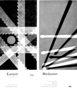
As a Swiss medical drug brand, Geigy, often followed bold-sans serif faces which had a wide – use on other Swiss publicities (that one can identify the Swiss ‘bold’ from miles away). Using bold- ‘neutral’ fonts that are the derivations of sans serif (like Akzidenz Grotesk, or Helvetica) had been a dominant fashion in design of Swiss advertising, it had not a wide-spread use of this style among other countries. The risk has ended with a full success; the dominant Swiss style on the brand was fully appreciated. This appreciation, for me, stemmed from the conative signs of the Style’s consistent bold typograhic choices that evokes a sense of reliability and stability (that implies a ‘lively’ presence on the ground rather than inconsistent and floathing types with their lightness and orniments) ; use of negative spaces refers to a hygiene, – finally recued from that ‘dirty’ viruses and diseases-.
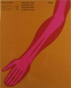
Fred Toller, became a prominent figure on designing advertisements, publications of Geigy drugs. His style differs from other ‘Geigys’ in terms of his characteristic juxtaposition of large and small types, his X-Ray like illustrations, that are bold again. That cartoonized boldness of subjects, smoothens the scary distance of illness, comes through with a smooth and warm implications of the healing drug. (Somehow his illustrations corresponds with the cut-outs of Saul Bass, in ‘One Armed Man’ and in ‘Anatomy of a Murder)
Studying under Emil Ruder and Armin Hofmann, Karl Gerstner is one of the most influencal contributes,r on remarkable designs within Geigy’s corporate idenity. His settlements are based on more complex grids (but his innovation of grid system is another huge topic) and unjustified than the other Swiss style.


